
- 2018 -
Client
Citi (Internal)
Citi (Internal)
Role
• Stakeholder interviews • Assisted with usability testing survey
• Concept designs • Competitor research
• Design persona • Journey mapping
• Collaborate with developers, technical writers, • Facilitate ideation session
product owners, Create production-level designs (UI)
• Stakeholder interviews • Assisted with usability testing survey
• Concept designs • Competitor research
• Design persona • Journey mapping
• Collaborate with developers, technical writers, • Facilitate ideation session
product owners, Create production-level designs (UI)
In this project, our objective was to envision the next generation, best-in-class acquisition and onboarding journey for Citi customers. We sought to create a way that would encourage users to take an active role in their financial growth. Our proposed solution is a goal oriented banking experience that adapts to the user's ever-evolving financial situation and needs in life. We wanted to create something that would educate and advise the users through passive recommendations, and establishes a digital relationship, while guiding them to financial maturation.
I was responsible for leading the design, which would start with a mobile-first approach. I have conducted a series of design thinking sessions with my team for concepting initial solutions. I have created prototypes, and worked with our research team to test for user reactions/feedback. We are continuously iterating, sharing insights along the way with our key stakeholders.
Below is our work in progress...
Below is our work in progress...

The Challenge
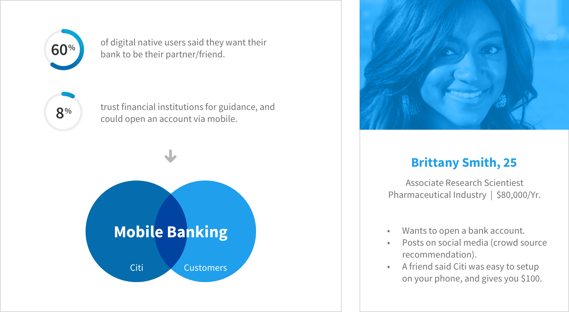
How do you take banking, something as old as human civilization itself, and transform it to fit the needs and values of today's customers? We decided to start the journey with an empathetic understanding of our users, and their frustrations.
Working-age Millennials are now the largest generation in the US workforce. It's an important time in their life as they are transitioning towards serious life decisions, and headed towards earning their peak income. However, they feel left out of the conversation when it comes to money. From our research, we learned that the banking experience with mobile is still broken, uninspiring, and allows the users to do most of the heavy lifting. So how do you bridge the gap between Citi and new customers?
Our concepts centered around few of the user goals — Acquisition should be conversational, always learning, and it should be fast.

A bank that grows with you
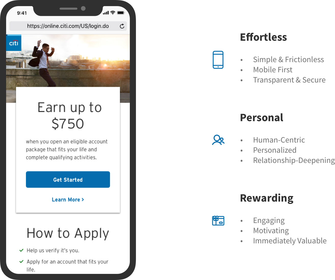
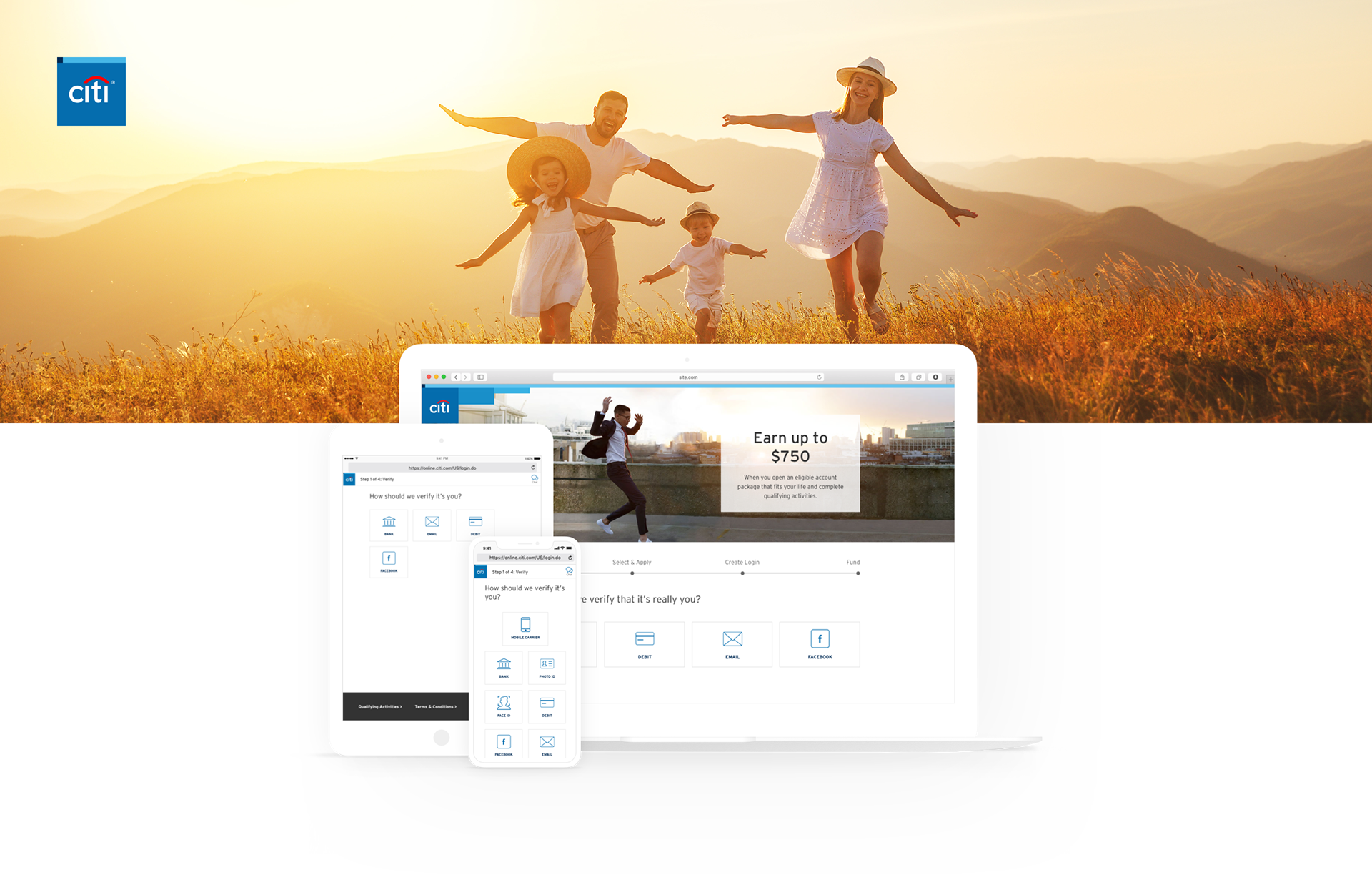
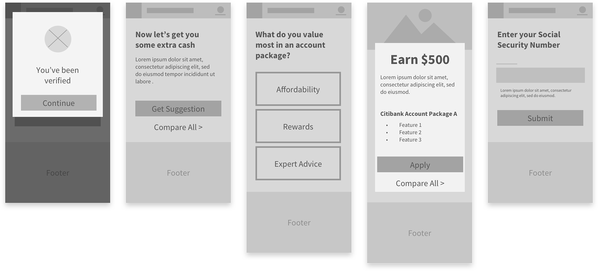
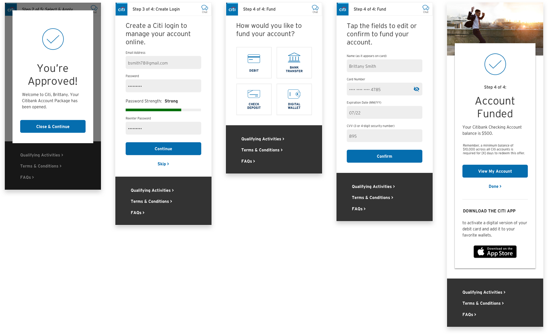
MVP Version
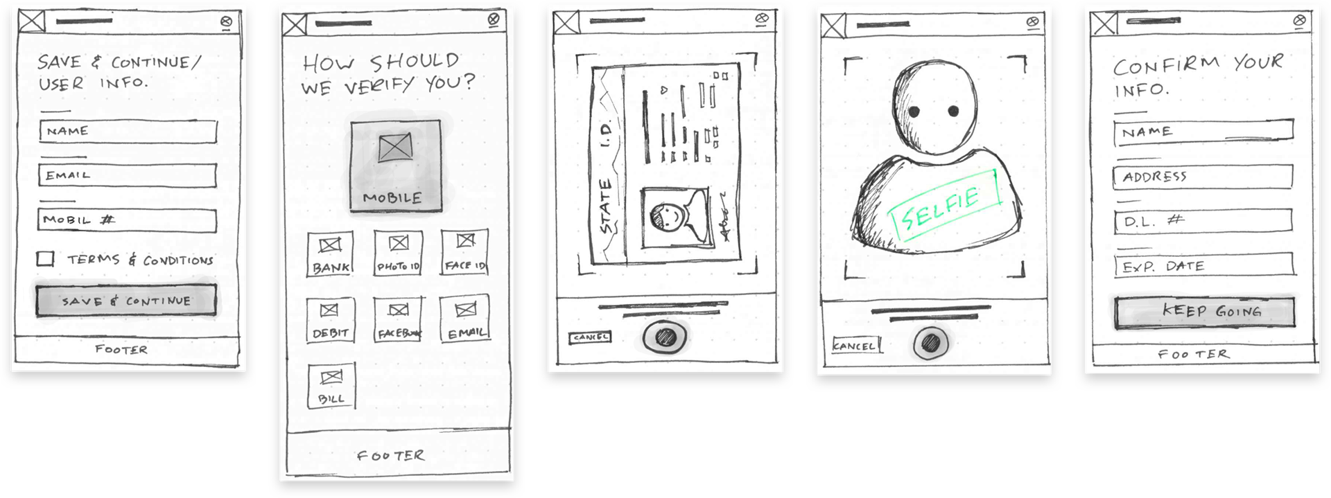
After many iterations and Blue Sky concepts, we decided to prioritize our design decision based on something that would allow for rapid development, and release to market. We also needed to make sure the designs are optimized for cross-device usability, incorporates the new Citi branding, and most importantly, complies with the Citi DDL (Digital Design Language).
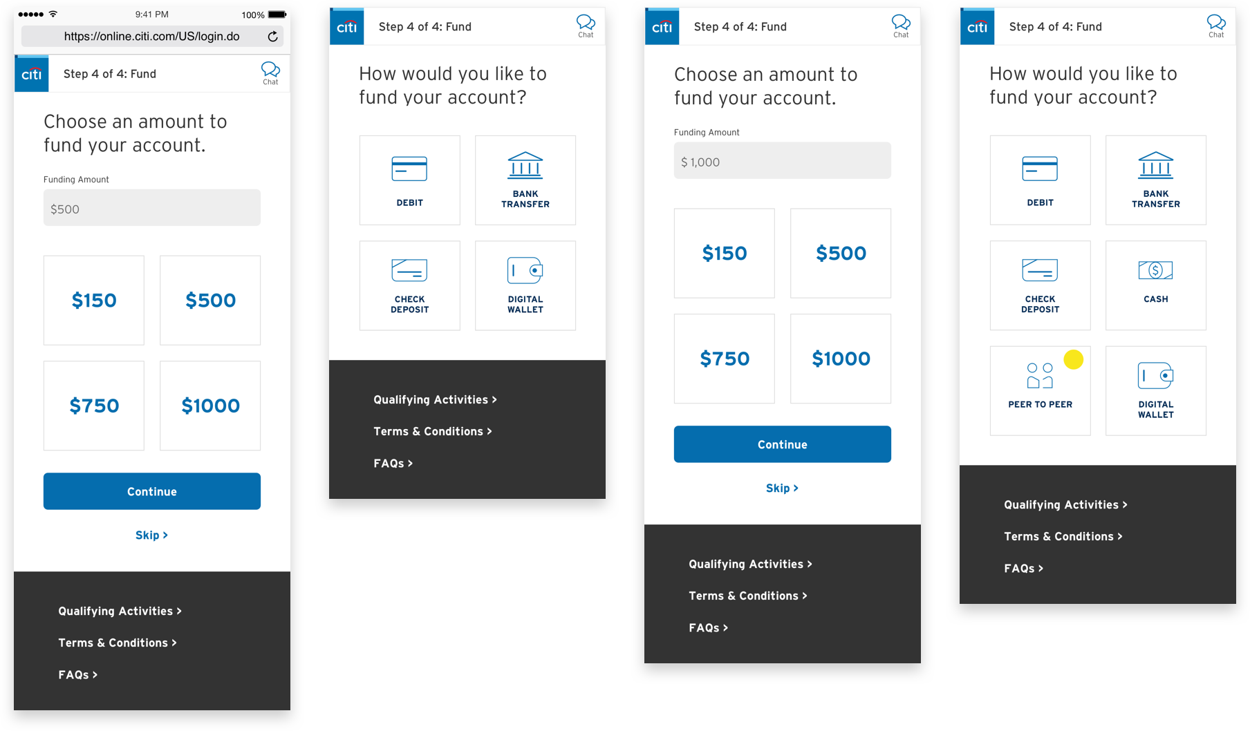
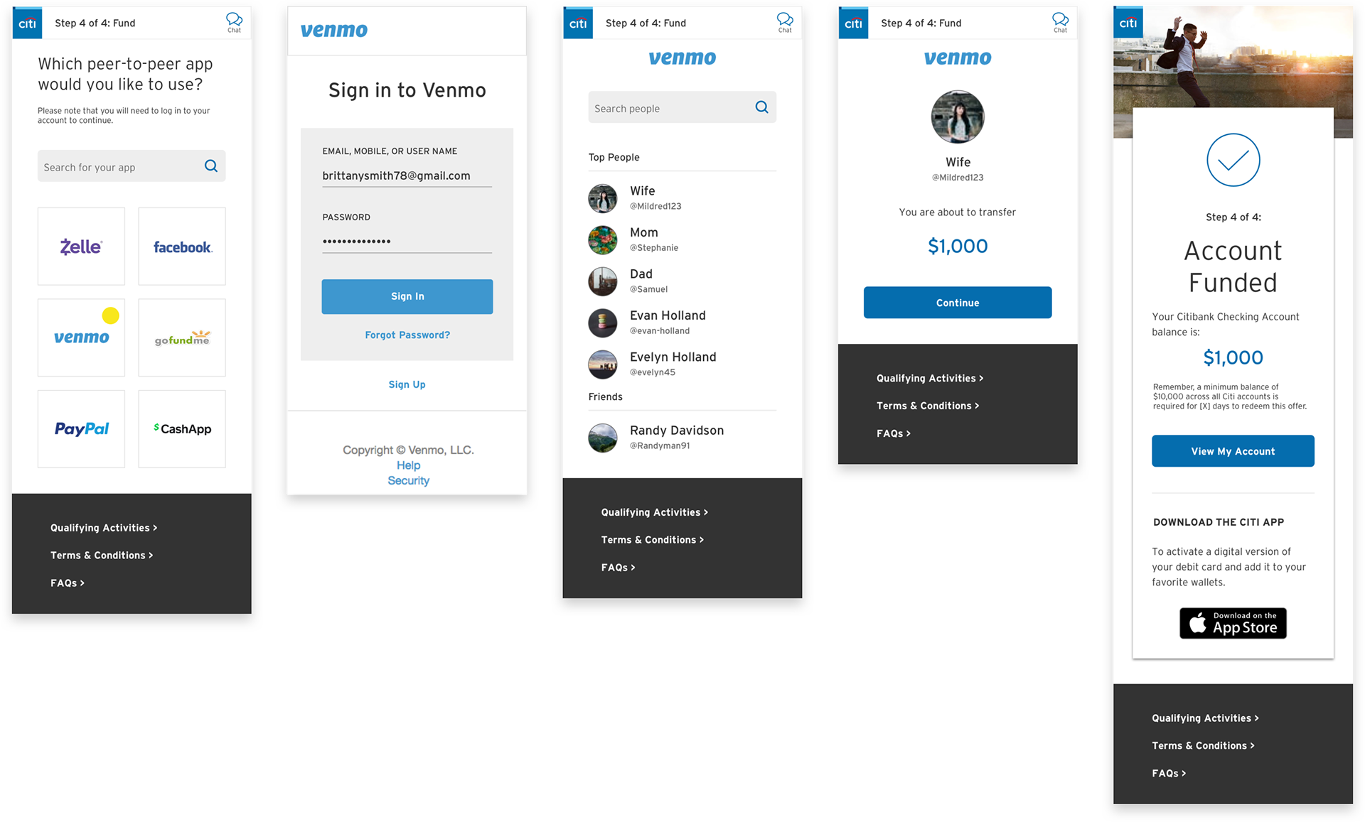
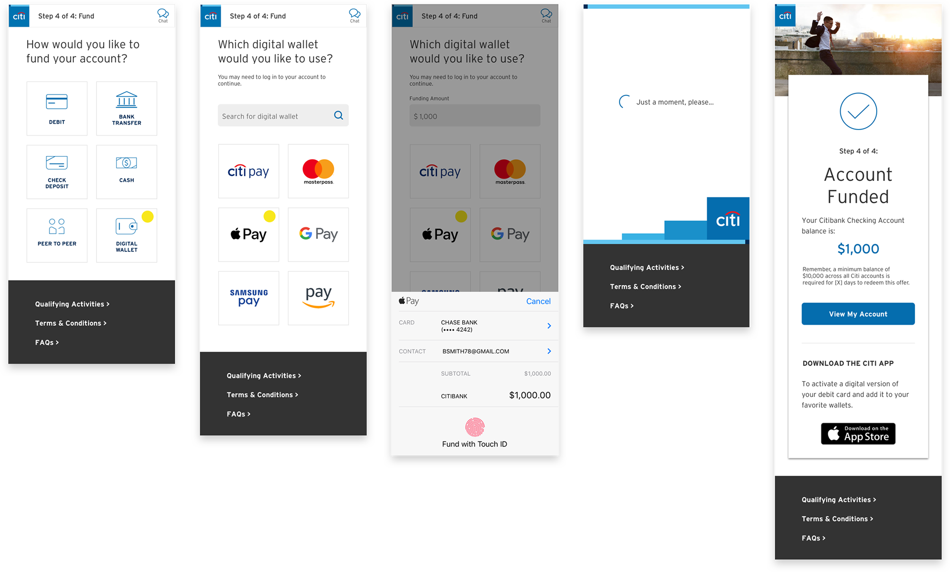
Funding options
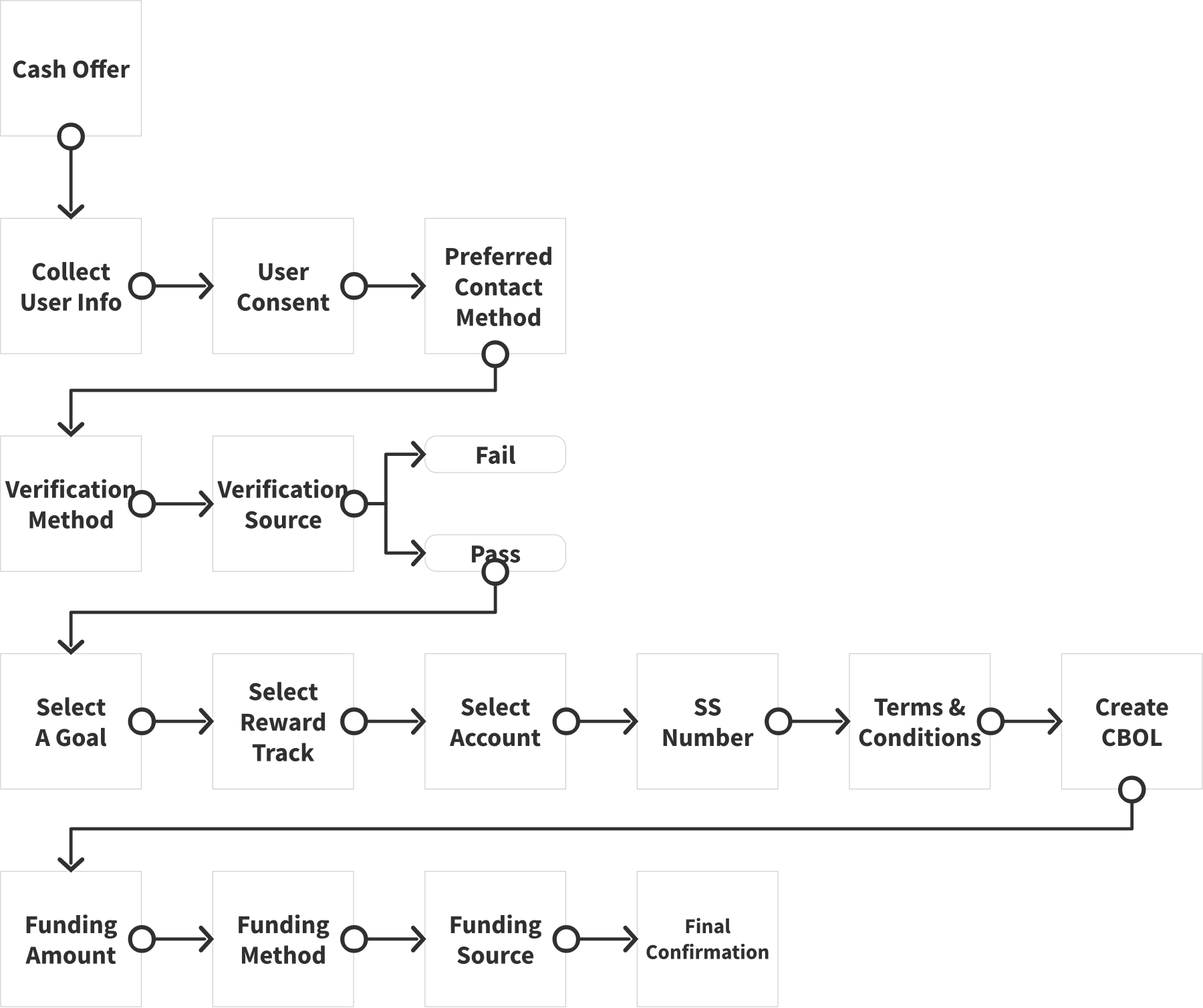
Information Architecture - Happy Path Summary
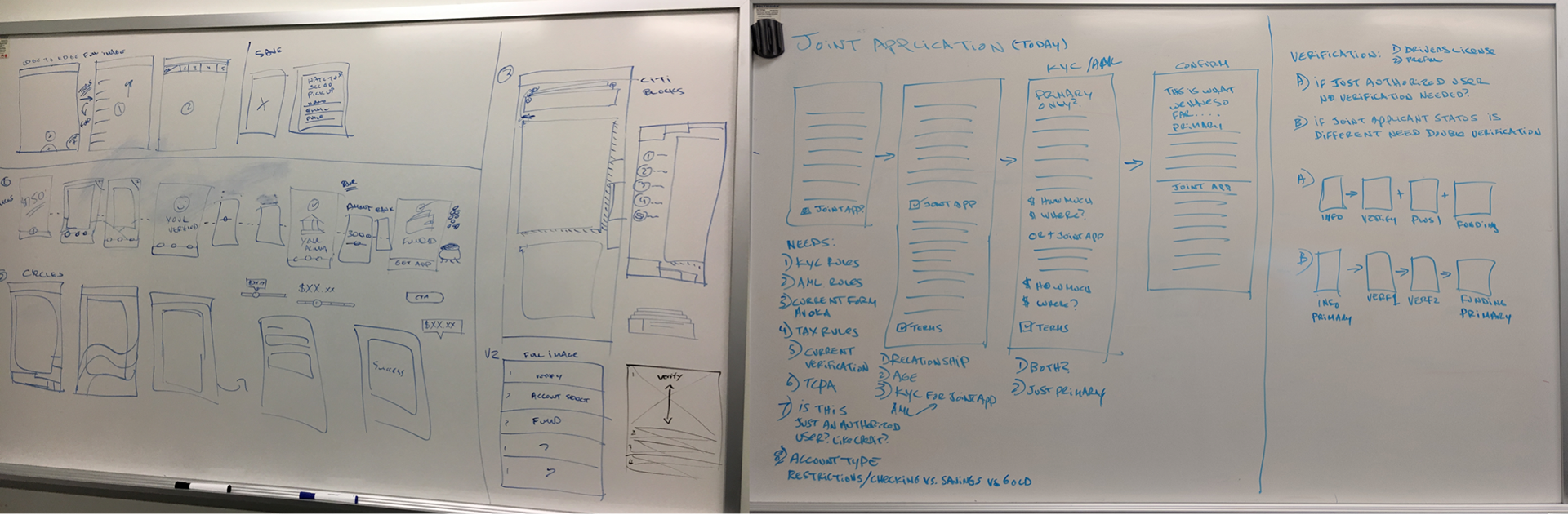
Early whiteboard sketches
Blue Sky Concepts/Solutions
At Citi, whenever we do design thinking without any limitations, we refer to that as "Blue Sky". In the beginning of the process, by not thinking about production, development, and marketing requirements, we can spend more time to freely explore endless possibilities.
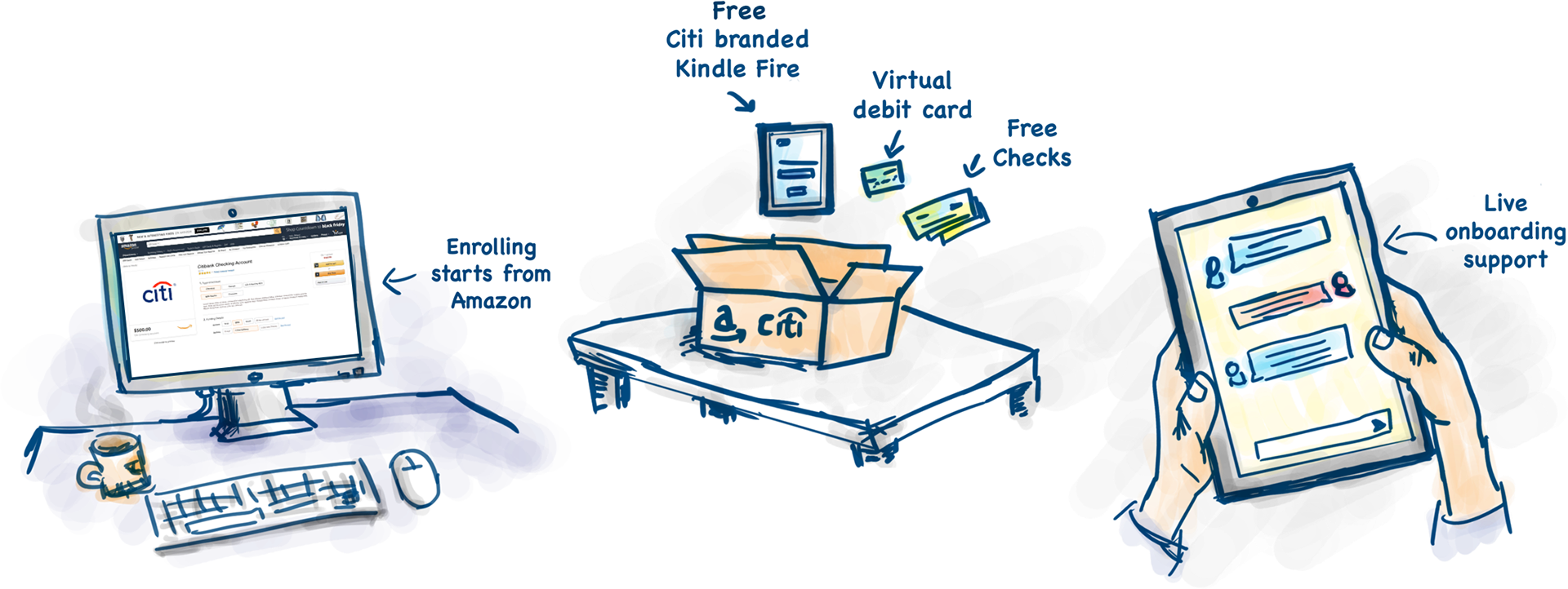
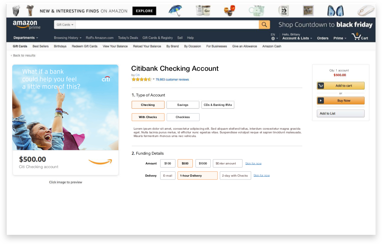
All of our concepts centered around one question, "How can we passively introduce Citi to new customers?" We answered this question with several concepts that use existing entry points to allow users to open an account.
Our main concept leverages Amazon shopping experience. Since the cost of acquisition is $250, we can use that to create an offer that gives you a free Kindle Fire if you sign up for an account. A user can select the type of account, funding amount, and checkout on Amazon. They will receive a physical package with a Citi branded Kindle Fire, which can then be used for a live onboarding to complete the account creation process. Here is the best part — they will get to keep the Kindle when they are done.
Concept 1
concept 2

concept 3
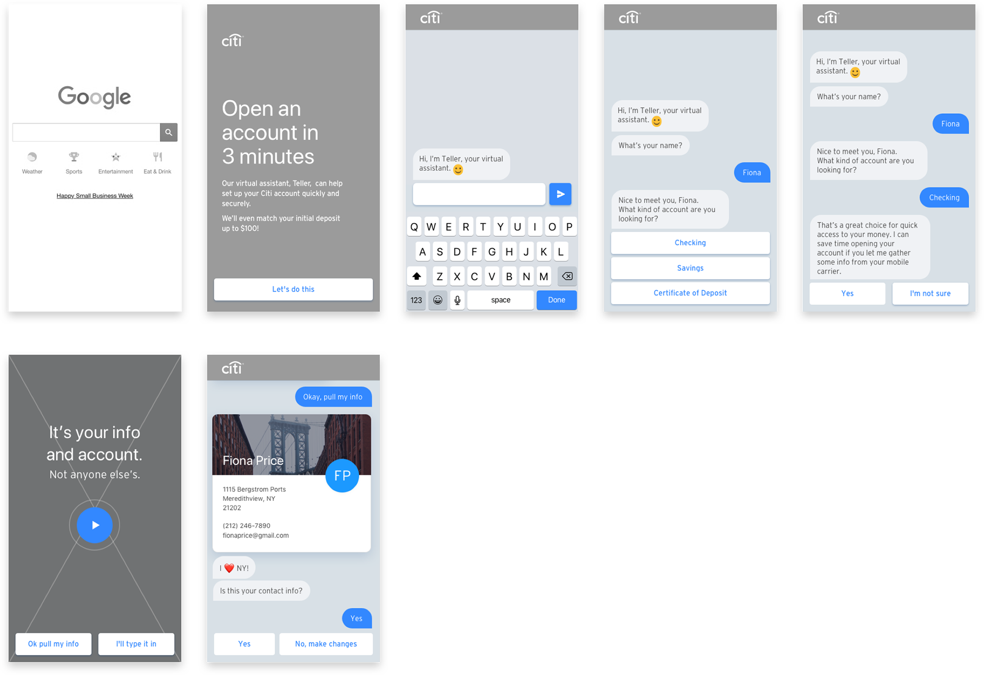
Ui exploration 1 - New user acquisition (mobile browser)
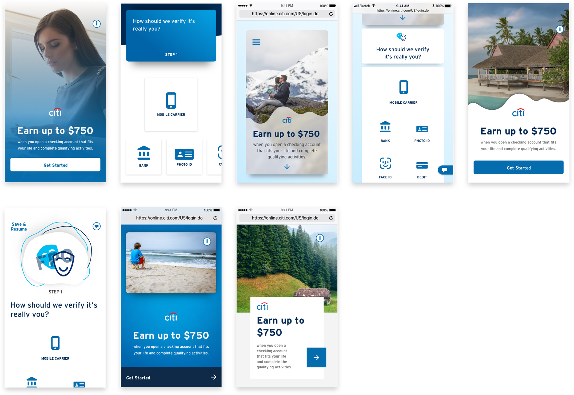
UI Exploration 2 - New user acquisition (desktop browser)

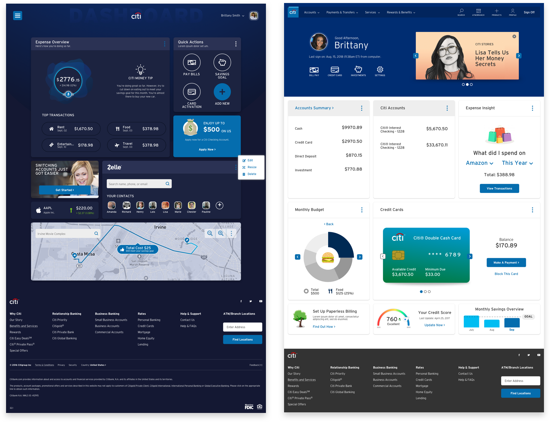
ui exploration 3 - post login dashboards (desktop browser)

User Testing Summary
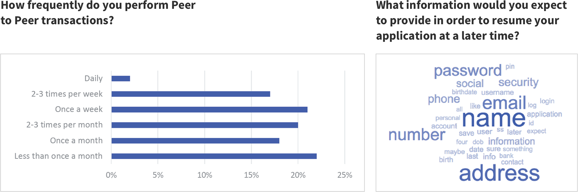
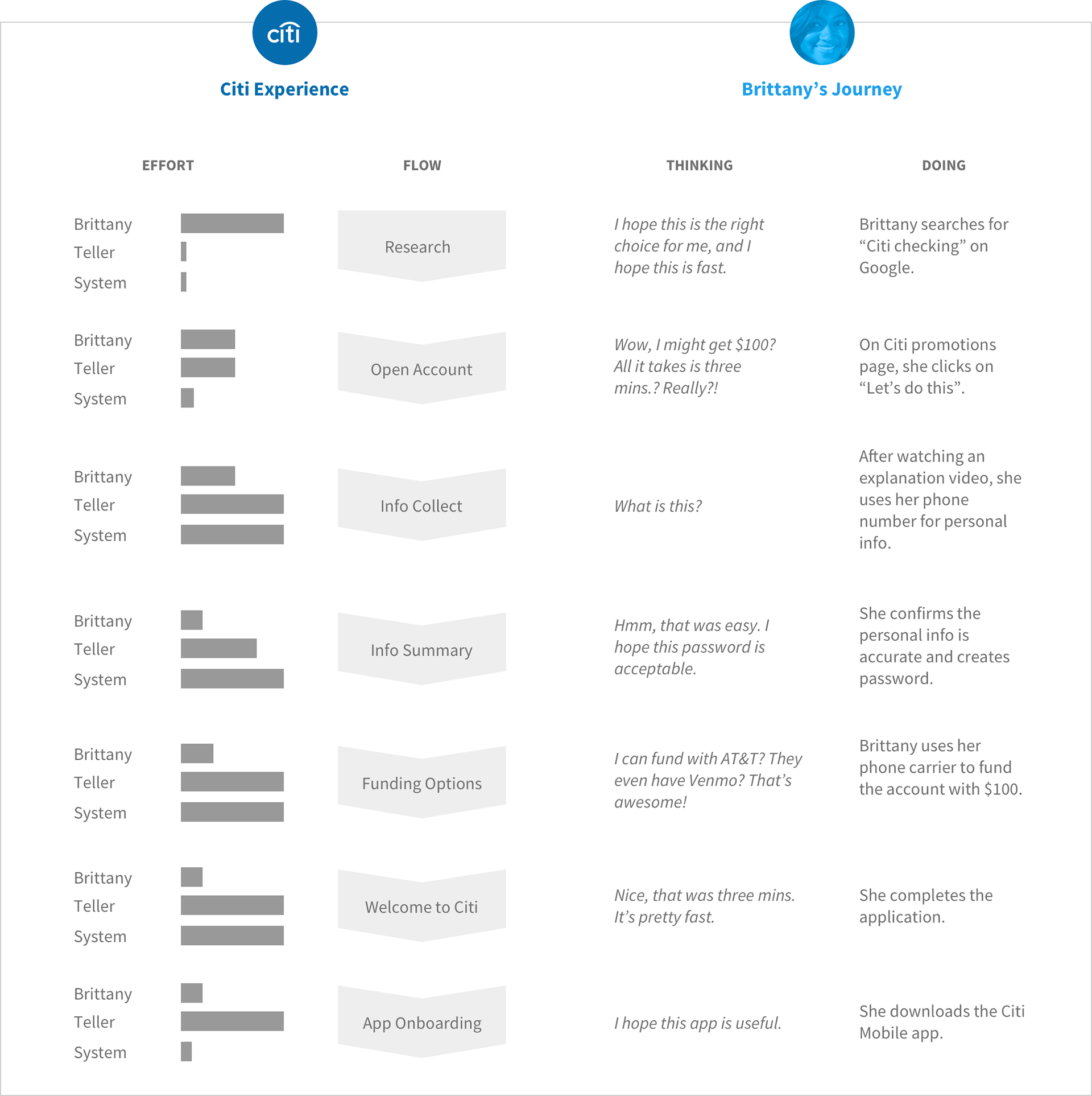
We have conducted early testing to gauge resonance of the overall application process. We wanted to probe the users for their feedback on some of our core features such as verification methods, funding options, save/resume, and personalized recommendations. Overall, we were looking for user reaction as they were going through our MVP flow.
Below are some of our findings:
What did you like the most about this experience?
• Ability to enter information via camera instead of typing it in; less prone to error.
• Not as difficult as they thought it would be.
• Citi held their hand through the entire process.
• Were given multiple options to accomplish tasks throughout.
• Ability to enter information via camera instead of typing it in; less prone to error.
• Not as difficult as they thought it would be.
• Citi held their hand through the entire process.
• Were given multiple options to accomplish tasks throughout.
What did you like the least about this experience?
• Want to know at the beginning what they are signing up for (terms).
• They were offered the digital debit card without being asked if they wanted it.
• Needs more wording and more information (provide clarity and detail).
• Had to provide SSN.
• Want to know at the beginning what they are signing up for (terms).
• They were offered the digital debit card without being asked if they wanted it.
• Needs more wording and more information (provide clarity and detail).
• Had to provide SSN.
Does this change your overall perception of Citi in any way?
• Had never considered Citi as a bank before.
• Sees Citi as a contender, a bank they could have a bigger relationship with.
• Quality was well-done and believes Citi has a good reputation for that.
• That Citi is more progressive, streamlined, and futuristic. That Citi is leading and setting the bar.
OVERALL PERCEPTIONS

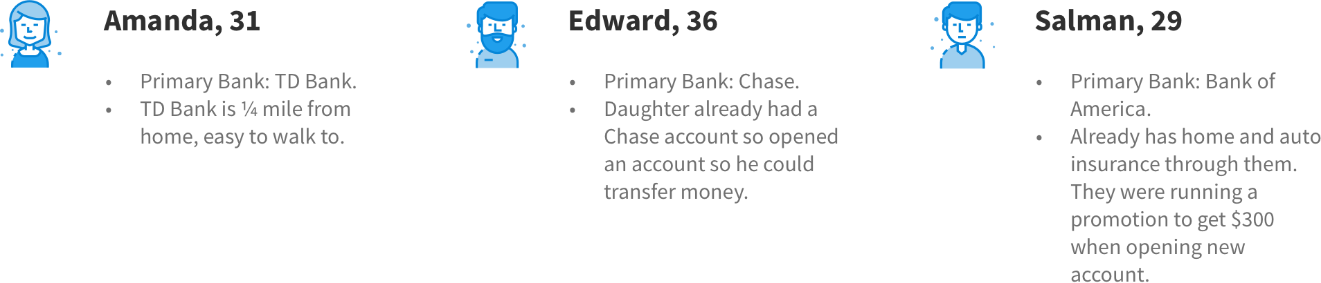
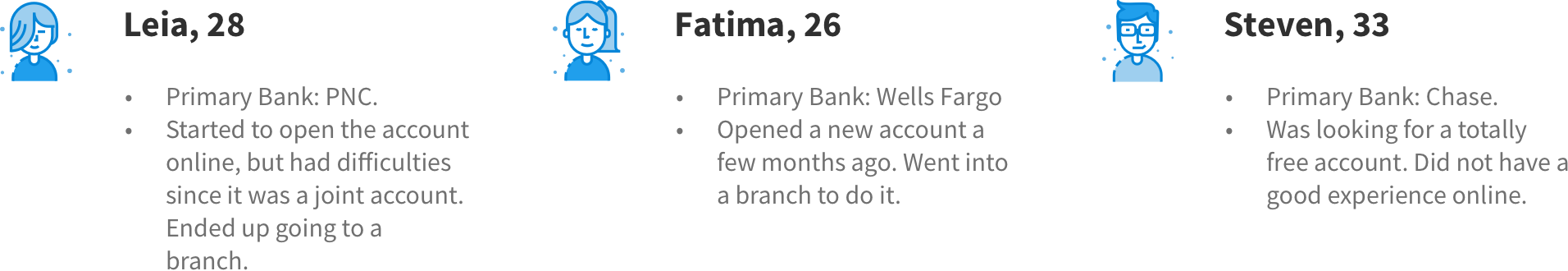
Test Participants
User data: peer-to-peer transfers